

Loading
Clear
Clear

-
{{ day.dayNumber }}{{ day.dayLabel }}
Selected
Available dates
Flight only or package holiday
Package holidays only
No Flights
Package holidays only
The date you've selected is only available for a Jet2holidays package.
Flight dates expired
Package holiday only
No Longer Available
{{ departureAirportsDisplayText }}
{{showMoreDepartureDisplayText}}
{{ destinationAirportsDisplayText }}
{{showMoreDestinationDisplayText}}
{{ monthDepartureDateDisplayText }}
{{ exactDepartureDateDisplayText }}
{{ exactReturnDateDisplayText }}
{{ search.Adults }}
Adult
Adults
, {{childCount}}
Child
Children
, {{infantCount}}
Infants
Infant
{{getTimeAgo.monthsAgo}}
months ago
month ago
{{getTimeAgo.daysAgo}}
days ago
day ago
{{getTimeAgo.hoursAgo}}
hours ago
hour ago
{{getTimeAgo.minutesAgo}}
minutes ago
minute ago
{{getTimeAgo.secondsAgo}}
seconds ago
second ago
Edit search
You've landed in the wrong place!
Discover our destinations
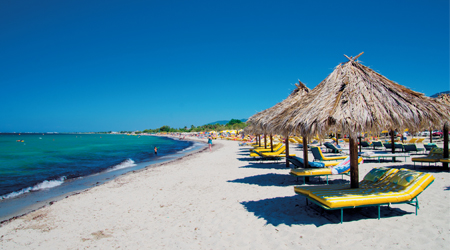
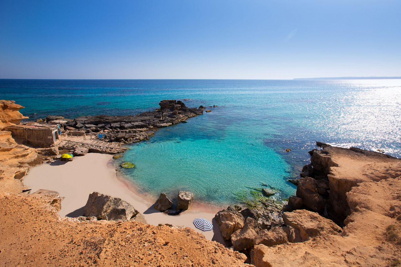
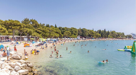
Looking to get away? Take a peek at where we can take you! From 14 UK airports, you can jet off to more than 75 dazzling destinations across Europe and beyond. Whether it’s a balmy beach, action-packed city or snow-topped ski destination you’re after, you’re bound to find your dream spot!

Find flights from your local UK departure airport


Upgrade to a package holiday

Low
£60pp
deposit*
£60pp
deposit*

*Terms and conditions apply